
When you’ve lovingly designed, built, and distributed your survey and responses start flooding in, it’s time to begin the process of sorting and analyzing the data you’ll be presenting to stakeholders.
Once you’ve weeded the unusable responses, begin recording relevant responses through your survey platform or in a spreadsheet. If you use survey software like CheckMarket, you can easily transfer data into visuals with pre-built reports and dashboards.
Decide your data groups. Was the survey just answering one over-arching question? Or do you have multiple areas covered? Represent each data group separately.
For each result, provide additional information such as why you conducted the survey, what questions you were trying to answer, how the results help businesses, and any surprising answers.
When you have the data separated, the next step is to identify and prioritize the information your stakeholders will most want to see.
Choosing the Right Data to Share
First things first: who is your audience? Is it your boss? Is it your peers? Is it your direct clients or customers? The information that clients want to see, for instance, may be completely different to what your boss is interested in. The information you choose to share will vary drastically depending on the campaign you’re working on.
For example, if you’re working on a new marketing campaign, your audience may be interested in how you plan on advertising your business and what perks that may bring them.
However, when it comes to your stakeholders, they will be less interested in the customer perks, and more interested in how this new campaign will work for the business. They might want to know:
- How is it going to grow your audience?
- How will it turn them from leads to paying customers?
- How can this help improve your business’s bottom line?
When you’re presenting results, clearly define the purpose of the survey and why it matters to your stakeholders. Your story should be specific and concise.
Raise vital questions early on and have the answers ready to go. Your stakeholders have a limited amount of time to listen to what you have to say – make sure you are making the most of it.
This means you’ll have to pick and choose your data results carefully. All results need to be relevant and essential. Your stakeholders will be interested in information that makes a difference. And you’ll want the answers to be presented in the easiest way possible – which is why you want to choose your display method carefully.

5 Ways to Display Your Survey Results
When you present results, you are looking to be clear, simple, and memorable. So, viewers should not have to ask you to explain your results.
Here are five common ways to present your survey results to businesses, stakeholders, and customers.
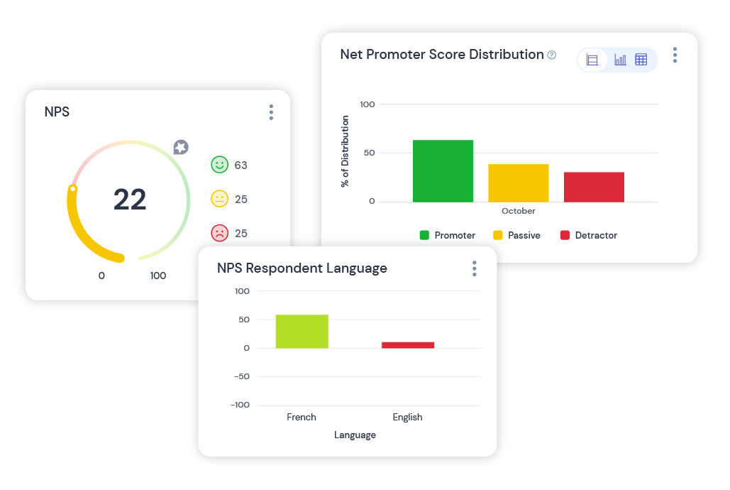
1. Graphs and Charts
Graphs and charts summarize survey results in a quick, easy graphic for people to understand. Some of the most common types of graphs include:
- Bar graphs are the most popular way to display results. Easily create, customize, and show results. Most people also know how to read a basic bar graph to interpret survey results.
- Line graphs show how results change over time by tracking the ups and downs of the data.
- Pie charts show the breakup of a whole into sections. For example, your whole could be the total number of respondents, and the sections represent percentages that answered a certain way.
- Venn diagrams show the interaction between respondents and their answers. For example, overlapping circles could show the differences and similarities in responses between parents who use a product versus non-parents who use a product.
When creating a chart or graph, make the findings clear to read. Avoid too many intersecting lines and text options. If you can’t fit all the information into one graph, create several graphs rather than making one complex chart. Using colors to differentiate groups is another way to make results easy to read.
2. Infographics
Infographics add a creative twist to otherwise bland charts and graphs. A good infographic will use images to enhance the message, not distract from the data.
One survey results presentation example is to use silhouettes of people to convey a percentage of the population instead of a bar graph. This image helps those who see it connect the statistic to real people.
A word cloud is a powerful way to display open-ended question responses graphically. As more people respond with a specific word, that word will appear in the cloud – emphasizing the most relevant answers.
3. Video and Animations
People spend over 100 minutes a day watching videos – which is why marketers have tapped into this strategic area for reaching an audience. Nearly 88% of marketers say video marketing yields a strong return.
A video is a powerful tool for presenting information, including the results of your survey. You can capture your audience’s attention with motion, sound, and colorful statistics to help them remember information and react accordingly.
If you present findings through video, be aware that sharing options will be limited to platforms that can play a video – such a blog posts, websites, and PowerPoint presentations. Also, creating a PDF of the findings for people to look over at their leisure is a helpful way to support a video presentation.
4. Spreadsheets
Spreadsheets like Excel are not visually appealing, but they work well for organizing large amounts of information to create a survey results report.
While an image or video works best on websites, sometimes you may need to add more information than can fit in one picture.
Suppose you wanted to provide stakeholders or business partners with a detailed look at the survey and all the responses. A spreadsheet will allow the freedom to display all the necessary information at once. You can still use attractive infographics to summarize the findings and a video to present the report along with the spreadsheet.
5. Interactive Clickable Results
Interactive results are a fun way to allow viewers to explore results. You can also organize the findings to help break up large amounts of information.
Interactive maps are a common way to display survey results graphically. For example, results can be viewed by region when they click on a specific map area. Interactive maps and displays work best for websites and blogs.
An infographic that summarizes all the data as a global average allows people who don’t have the time to explore the map to see the information.
Customize Your Results in One Place
Time is precious in the marketing industry. You don’t want to spend days analyzing and sorting through survey results.
And you don’t have to.
By using CheckMarket, you can create, gather, and present survey results with one easy-to-use platform.
Geef een antwoord