Use your own CSS to customize the look of your surveys to match your branding and design needs. By adding custom CSS, you have total control over every aspect of the survey style. You can add your CSS on the survey appearance page which you can find in each survey via Settings > Appearance.
The custom CSS can also be saved in themes and reused across multiple surveys.
The example CSS snippets below can be used directly in your survey, or you can use them as a starting point for your own cool survey designs. If you want to have a specific design but you don’t have any knowledge of CSS, or do not have the time, you can contact our design team to provide you with a price quote for a custom design.
More info on CSS can be found here: https://www.w3schools.com/css/
Survey CSS examples
You can use custom fonts in your CheckMarket survey by using Google Webfonts.
- Go to https://fonts.google.com/ and find the font that you want to use.
- Select the font by clicking the + sign, next a black box will appear on the bottom of the page.
- Click the black box, to open the drawer.
- Copy the CSS code @import url(‘https://fon….
- Paste the @import code on the first line, before all other CSS code in your survey
In the example below we used the Raleway webfont
@import url(‘https://fonts.googleapis.com/css?family=Raleway&display=swap’);
@import url('https://fonts.googleapis.com/css?family=Raleway&display=swap');
body,
p,
h1,
h2,
h3,
h4,
h5,
h6,
.heading-table,
.greeting,
div.greeting,
.button,
.ladda-button,
th.question,
td.question,
table,
.nps input,
input,
input,
textarea,
select,
button,
.matrixTable .sub-question,
th.subquestion, td.matrix_ratingpoints,
.response,
.radio label,
.checkbox label,
.ratingscale .innerCell,
.systemText.previewWarning,
.greeting {
font-family: 'Raleway', Arial, sans-serif;}The CSS snippet below will hide the radio buttons and/or checkboxes in your survey.
/*This hides the radio button*/
.radio input[type="radio"]{
display: none;
}

/*This hides the checkbox*/
.checkbox input[type="checkbox"]{
display: none;
}The CSS snippet below will modify the text of your survey’s “next” button. The same principle can be used to change the text of the ‘Previous’ or ‘Finish’ button.
We added some comments in the snippet that explains how to target specific survey languages in your survey.
/* Remove the current displayed text in each language */

button.button.ladda-button.nextButton {
color: transparent;
position: relative;

}

/* Display a new text on the button, the code below, targets every available language of the survey, read the info below, if you want to target a specific survey language*/

button.button.ladda-button.nextButton:before {
content: 'Bevestig';
color: #fff;
position: absolute;

}

/* INFO */

/*target text button in English - use the css selector below to target specific language, if not used, the text will be the same in each language :lang ([language code])> Depending the text that needs to be displayed, play*/

/*around with the padding, to assure the text is aligned properly in the middle of the button*/

/*END INFO */

:lang(en)>button.button.ladda-button.nextButton:before {
content: 'Confirm';
color: #fff;
position: absolute;
}

/* target button on specific survey page*/

/*use : .page-xx */

/*The example below shows you how to target the next button on page 8 of your survey. */

/*Keep in mind to update the css if pages are added in your survey (this way you can target any element on a specific page:.page-8 button.button.ladda-button.nextButton { color: transparent;}*/The CSS snippet below will allow you to change the text of your surveys finish button. In the example below, we replaced the Finish text with Confirm your vote
button.button.ladda-button.finishButton.nextButton:before {
    content: 'Confirm your registration';
    color: black;
    position: absolute;
}

button.button.ladda-button.finishButton.nextButton {
    position: relative;
    color: transparent;
}.btn-group-lg>.btn,
.btn-lg {
color: transparent !important;
position: relative;
}
button.button.startButton.btn-lg:before {
content: 'Start';
color: #FFF;
position: absolute;
}
/* INFO */
/*target text button in English - use the css selector below to target specific language, if not used, the text will be the same in each language :lang ([language code])> Depending the text that needs to be displayed, play*/
:lang(nl)>button.button.startButton.btn-lg:before {
content: 'Begin';
color: #FFF;
position:absolute;
}
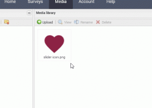
/*END INFO */The CSS snipped shows that you can change the Slider’s handle by another icon.
The icon we used in this example, is a heart icon.
- Upload the image that you want to use in your media library.
- Resize the icon in your media library using the resize tool:
- Double click the image to get the full image URL.
.rangeslider__handle {
    background-image: url(URL TO FILE IN MEDIA LIBRARY ) !important;
    background-size: 100% !important;
    background-image: -moz-linear-gradient(rgba(255, 255, 255, 0), rgba(0, 0, 0, .1));
    -moz-box-shadow: 0;
    -webkit-box-shadow: 0;
    box-shadow: none;
    -moz-border-radius: 50%;
    -webkit-border-radius: 0%;
    border-radius: 0;
}

.rangeslider__horizontal {
    height: 4px;
    width: 100%;
}

.rangeslider {
    background: #000000;
    position: relative;
    height: 3px;
}

.rangeslider__filled {
    background: #000000;
    height: 10px !important;
}

.rangeslider__fill {
    -webkit-border-radius: 0 !important;
    border-radius: 0 !important;
}

.rangeslider__handle {
    background: none;
    border: none;
    top: -15px !important;
}
Download the image icon used in this example
Tip: resize the image to 32 x 32 px
Show a full width progress bar over the full width of your survey.
The color of the progress bar can be set in the Progress bar tab of your surveys appearance.
/*Progressbar*/

.progressWrapper {
    position: fixed;
    width: 100%;
    left: 0;
    right: 0;
    top: 0;
}

.progress {
    width: 100%;
    overflow: hidden;
    height: 10px;
    margin-top: 0;
}

.progress-text {
    display: none;
}By default, de selected banner will be displayed at the width in pixels of your survey. The CSS snippet will show the banner across the entire width and top of the survey
/*add full width banner with logo to your survey*/
/*the banner image can be set in the survey appearance > Banner tab*/

.banner div.center,
.banner h1.center {
    border-radius: 0;
    position: absolute;
    top: 0;
    left: 0;
    width: 100%;
    align-content: center;
    margin: 0 auto;
    background: #000;
    padding-top: 20px
}

.banner div.center img,
.banner h1.center img {
    padding-bottom: 10px
}

.pageWrapper {
    /* Margin to ensure that the survey is not under the banner */
    margin-top: 5rem;
    /* Margin to ensure that the survey is not under the footer */
    margin-bottom: 5rem;
}
/*add full widht footer with logo to your survey*/

.footer:after {
    position: fixed;
    width: 100%;
    bottom: 0;
    height: 4rem;
    background-color: #000;
    left: 0;
    background-image: url(URL TO LOGO MEDIA LIBRARY);
    background-repeat: no-repeat;
    background-size: 4rem;
    background-position: center;
    content: '';
    color: transparent
}When the respondent forgets to answer a question, he will be notified by a message ‘you forgot to answer a question’. When you have the need to personalize this, you can do this using some custom CSS
/* removes the current message */
#messageBar span {
color: transparent !important;
position: relative;
}

/* inject a new message to show to the respondent */
#messageBar:after {
 content: 'Oops, you forgot to answer a question';
 color: #76640f;
font-weight: bold;
font-size: 120%;
}
If your survey has more than one language, place this front of the styles: ‘:lang(en)>’. Repeat for each language replacing ‘en’ by the correct language code. For example:
/* removes the current message that is displayed for the English language */
:lang(en)> #messageBar span {
color: transparent !important;
position: relative;
}
The CSS snippet below will allow you to hide the scale value above matrix question columns.
.matrixTable thead th span, .matrix thead th span {
    display:none;
}
The CSS snippet below will make sure your report title is centered inside the PDF or when printing.
@media print {
  .headerLeft h1 {
     text-align: center !important;
  }
}
To apply this snippet in your report, open the report for editing, open the main menu, choose Style and scroll down to Custom CSS.
Use the CSS code below to change the colors of the thank you pages. There are two kinds of thank-you pages: The normal one and the alternate thank-you page. In this example, we set the normal thank-you page to green with white text and the alternate thank-you page to red with white text.
body.thank-you-page,
body.thank-you-page h1,
body.thank-you-page h2,
body.thank-you-page h3,
body.thank-you-page h4,
body.thank-you-page a,
body.thank-you-page .pageWrapper,
body.thank-you-page div.greeting {
    background: #66C96A;
    color: #fff
}

body.thank-you-page.alternate,
body.thank-you-page.alternate h1,
body.thank-you-page.alternate h2,
body.thank-you-page.alternate h3,
body.thank-you-page.alternate h4,
body.thank-you-page.alternate a,
body.thank-you-page.alternate .pageWrapper,
body.thank-you-page.alternate div.greeting {
    background: #FF5D50;
    color: #fff
}Use the CSS below to alter the width of the first column of your matrix question.
.matrixTable .firstColumn {
    width: 80%;
}To hide the next button on a specific page, use this:
.page-2 .nextButton {
visibility: hidden !important;
}
Here we are hiding it on page 2. To hide it on a different page, just change the ‘2’ to the correct page number.
To hide the next button until the respondent has fully viewed an embedded video, use the class disableNextTillEndVideo in the embed code you are using. Use this in a text / media element in your survey.
Example:
<div class="videoContainer"> <div class="videoWrapper"> <iframe id="YTPlayer" class="disableNextTillEndVideo" src="URL_TO_VIDEO" frameborder="0" ></iframe> </div> </div> </div>Depending the requirements you might want to hide the controls from a video to prevent the respondent fast forwarding the video. When the video file is imported in your media library, you are able to hide the controls using CSS. Adding the CSS snippet below to your custom CSS will hide the video controls:
.jw-controlbar {
display: none !important;
}
In video platforms like Youtube you can use the inline function ‘controls=0’ in the embed code to hide the video controls.
More info: https://developers.google.com/youtube/player_parameters
Use the CSS below to add a color scale to your NPS question:
.nps td:nth-child(1) div {
background-color: rgb(255 0 0 / 30%);
}

.nps td:nth-child(1) div.selected,
.nps td:nth-child(1) div.selected:hover {
background: red;
}

.nps td:nth-child(2) div {
background-color: rgb(255 0 0 / 30%);
}
.nps td:nth-child(2) div.selected,
.nps td:nth-child(2) div.selected:hover {
background: red;
}
.nps td:nth-child(3) div {
background-color: rgb(255 0 0 / 30%);
}
.nps td:nth-child(3) div.selected,
.nps td:nth-child(3) div.selected:hover {
background: red;
}
.nps td:nth-child(4) div {
background-color: rgb(255 0 0 / 30%);
}
.nps td:nth-child(4) div.selected,
.nps td:nth-child(4) div.selected:hover {
background: red;
}
.nps td:nth-child(5) div {
background-color: rgb(255 0 0 / 30%);
}
.nps td:nth-child(5) div.selected,
.nps td:nth-child(5) div.selected:hover {
background: red;
}
.nps td:nth-child(6) div {
background-color: rgb(255 0 0 / 30%);
}
.nps td:nth-child(6) div.selected,
.nps td:nth-child(6) div.selected:hover {
background: red;
}
.nps td:nth-child(7) div {
background-color: rgb(255 0 0 / 30%);
}
.nps td:nth-child(7) div.selected,
.nps td:nth-child(7) div.selected:hover {
background: red;
}
.nps td:nth-child(8) div {
background-color: rgb(255 165 0 / 30%);
}
.nps td:nth-child(8) div.selected,
.nps td:nth-child(8) div.selected:hover {
background: orange;
}
.nps td:nth-child(9) div {
background-color: rgb(255 165 0 / 30%);
}
.nps td:nth-child(9) div.selected,
.nps td:nth-child(0) div.selected:hover {
background: orange;
}
.nps td:nth-child(10) div {
background-color: rgb(0 128 0 / 30%);
}
.nps td:nth-child(10) div.selected,
.nps td:nth-child(10) div.selected:hover {
background: green;
}
.nps td:nth-child(11) div {
background-color: rgb(0 128 0 / 30%);
}
.nps td:nth-child(11) div.selected,
.nps td:nth-child(11) div.selected:hover {
background: green;
}
More information about the NPS question can be found on following pages:
- Net Promoter Score (NPS) – use, application and pitfalls
- Net Promoter Score Software
- NPS – Advanced Workflow
- NPS – Get everybody involved
- NPS clearly explained in 14 slides (Slideshare)
- Look at sample NPS survey results
(Password to access results: NPScore) - Use our NPS Calculator
- How to turn NPS passives into promoters
- How to turn NPS detractors into promoters
Geef een antwoord